CIMIC Group Limited is a world-leading infrastructure, mining, services, and public-private partnerships group. They have businesses in construction, mining and mineral processing, operation and maintenance services, public-private partnerships and engineering. Their mission is to generate sustainable shareholder returns by delivering innovative and competitive solutions for clients and safe, fulfilling careers for our people.
In early 2017, the CIMIC Group granted to 7strategy the task of redesigning their website. My responsibility as the Lead UX Designer was to create a digital platform that would help improve the visibility of the content and overall user experience. My approach was to provide CIMIC with recommendations and suggestions on how they could improve the overall UX of their current website and create a positive user journey that aligns with their existing marketing strategy. For this purpose, I had daily one-hour phone calls with their Marketing Director and Operation, in which I Interviewed her looking for information on their vision for the redesign, along with data on their industry and market. Based on her feedback, I was able to identify the following stakeholder goals for the project:
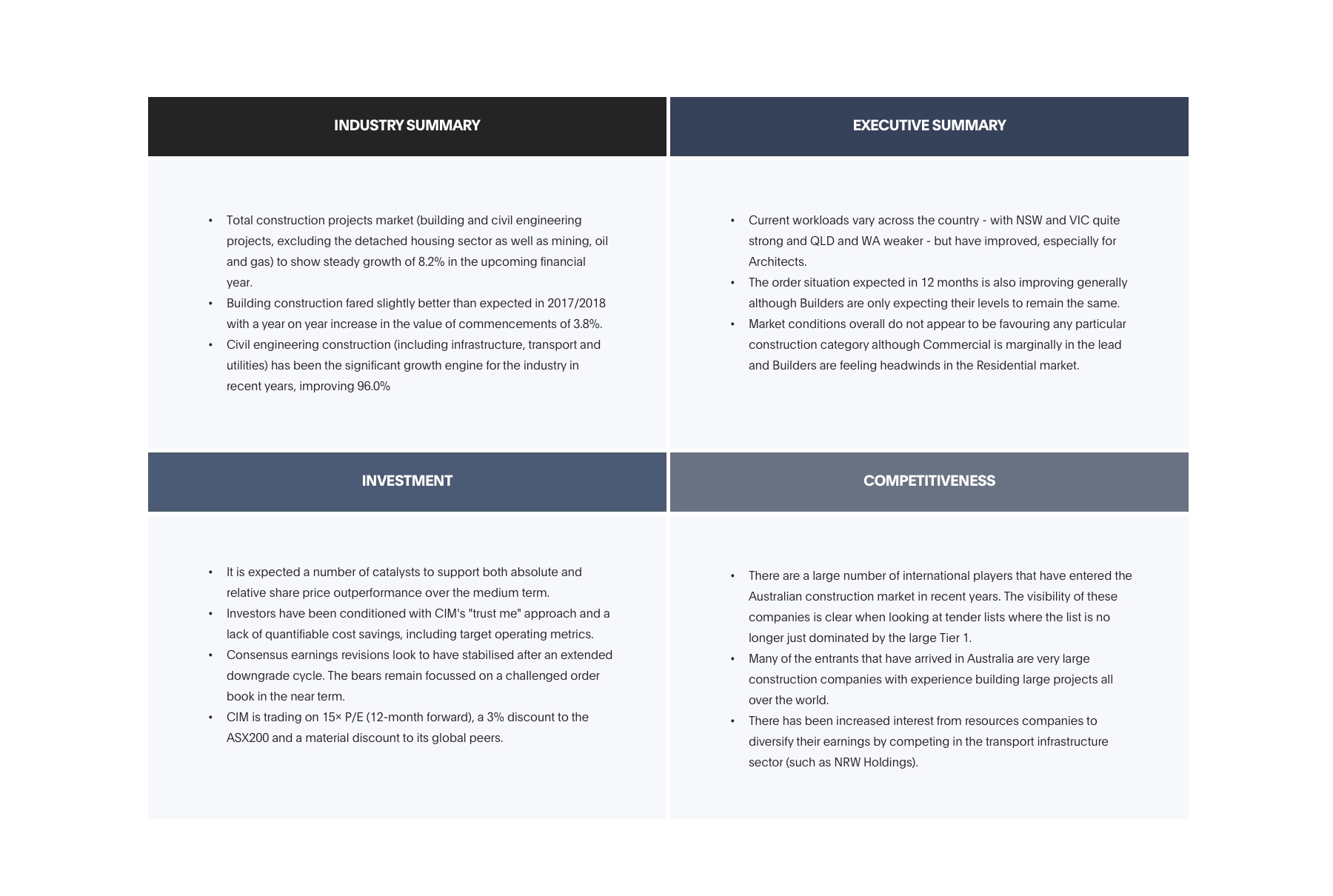
An extensive Competitor Analysis was conducted with CIMIC Group directly related to their business model as well as indirect competitors; I audited information structure, layout, tone, and navigation.
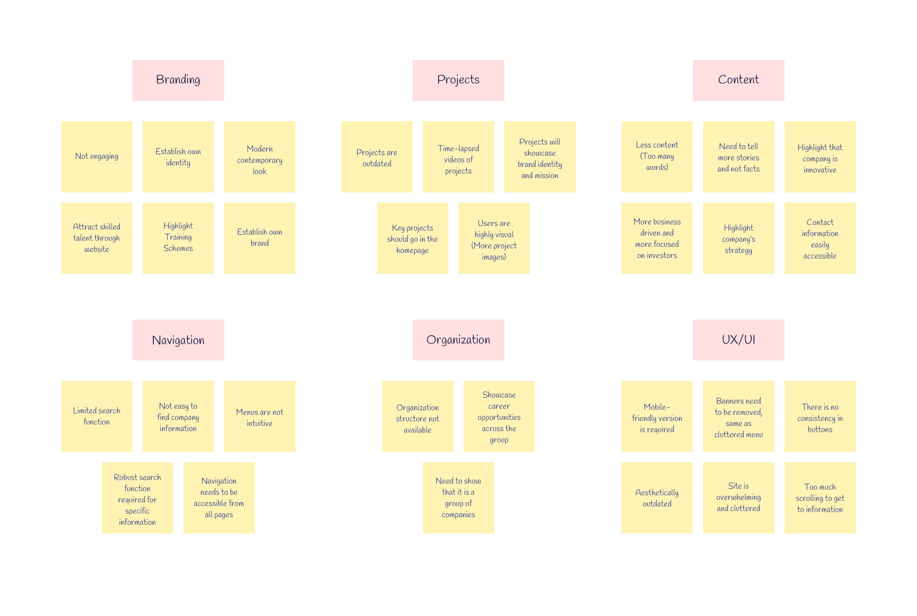
To gain primary research from users, I conducted User Interviews with 7 participants about their navigation experience with the current website. The interviews consisted of open-ended questions about their perception of the site from an aesthetical and functional standpoint. By the end, I was able to learn more about how users behave and see patterns emerging.
The results of these interviews were analyzed and categorized through affinity mapping. The affinity map helped us to discover the main challenges users encounter as they used the website. This gave us a better understanding of the needs of the target audience.
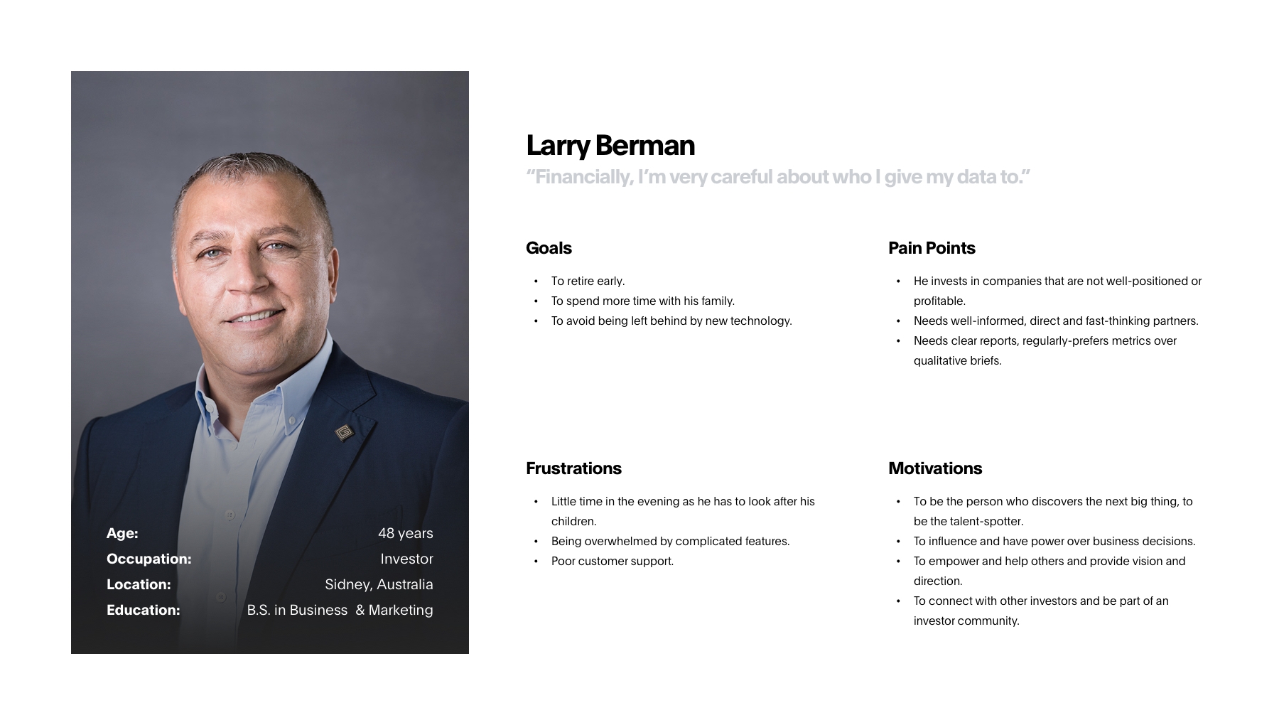
Next, I created four User Personas to represent the findings synthesized from the empathy map – Prospective Talent, Supplier, Investor, and Media. They reflected the target customers and are characterized by the most common traits and behaviors from the interview participants. By giving context and personality to the research data, we can better empathize with the target user throughout the design process. This step helped me to understand the needs of the target audience:
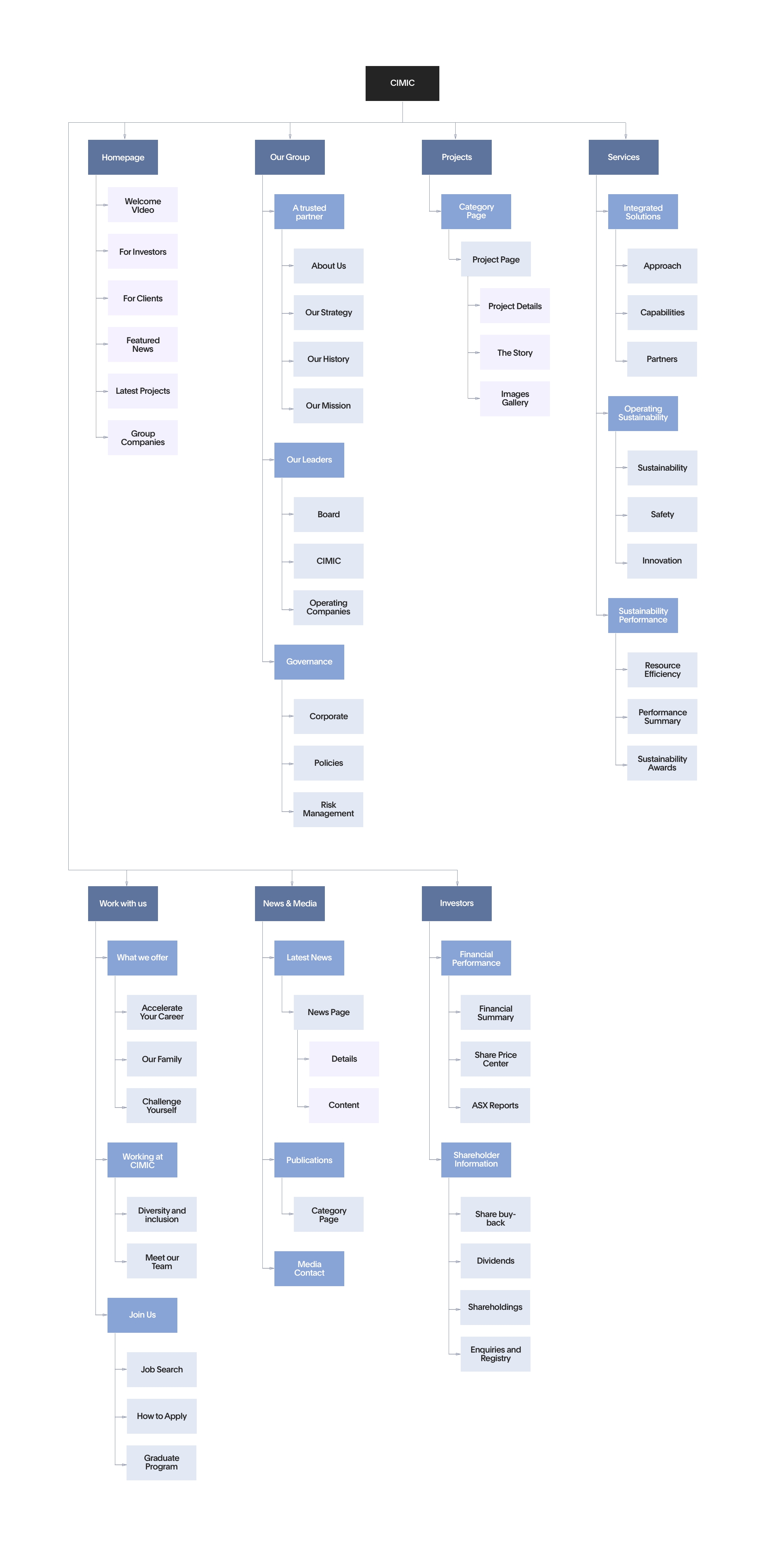
An open Card Sorting activity was conducted with 2 participants and consisted of 36 categorical terms commonly found during my competitor’s analysis. Through observation and feedback, I was able to understand how the participants structured information in their minds, which informs how I should then design the information architecture to be intuitive for the user. Based off of these findings, I hypothesized that the most universally understood way to organize these terms was by user tasks (Calculating ROI, Finding jobs, Learning about the market, etc…). I created a Sitemap based on existing design patterns for corporate sites and the findings from the card sorting activity. By visualizing the information architecture and identifying key relationships between screens, I could better understand the flows and interactions throughout the site.
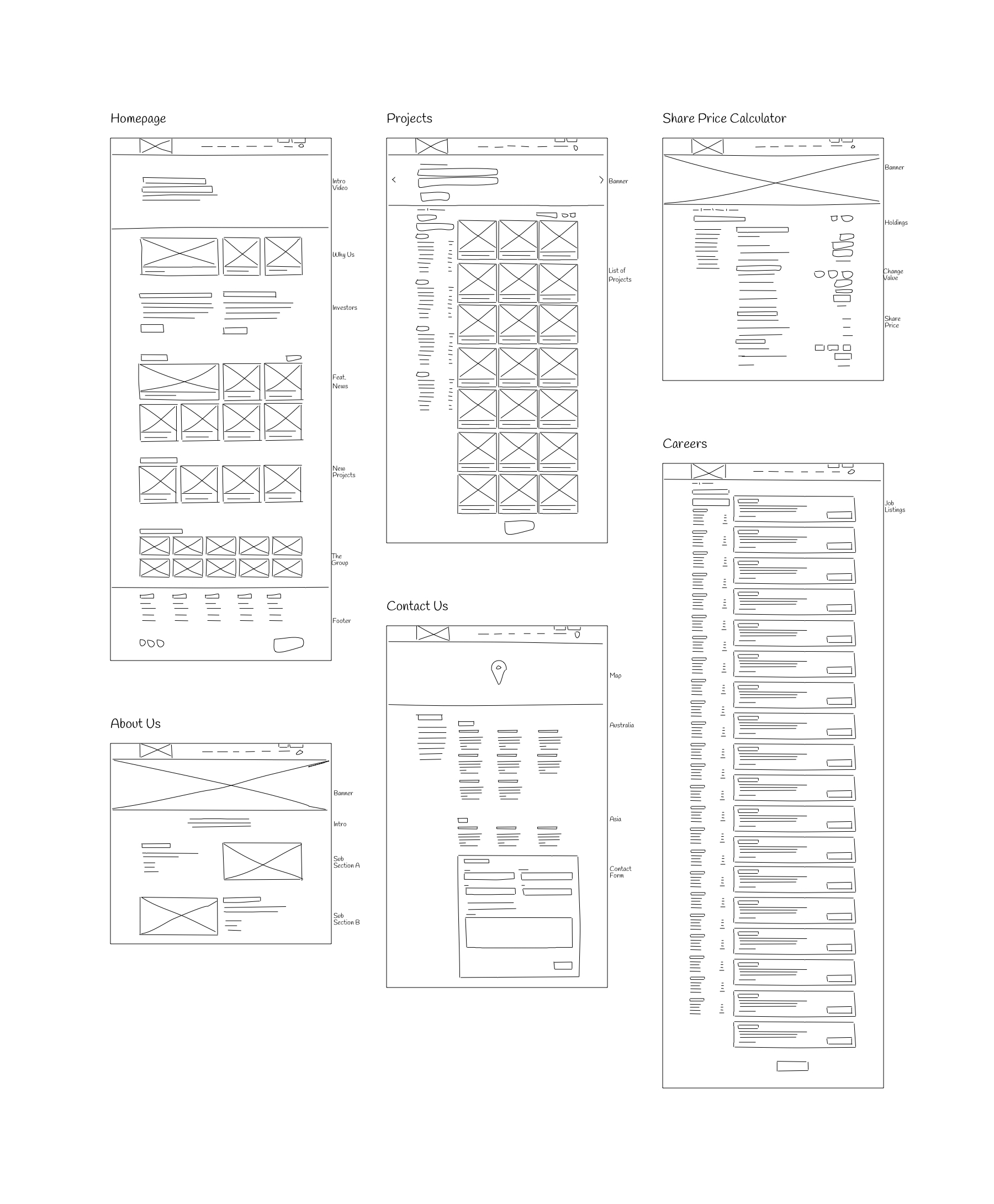
Once I had a better understanding of stakeholders and user needs, I began designing the UI by drawing low-fidelity Sketches for critical pages. By presenting annotated sketches to the project stakeholders, I was able to quickly gain feedback about my designs and make improvements for the next iteration. In total, I did sketches for 10 different pages of the website with the purpose of showing it to the client, looking to gain insights from them on my initial concepts. Some of my key findings included:
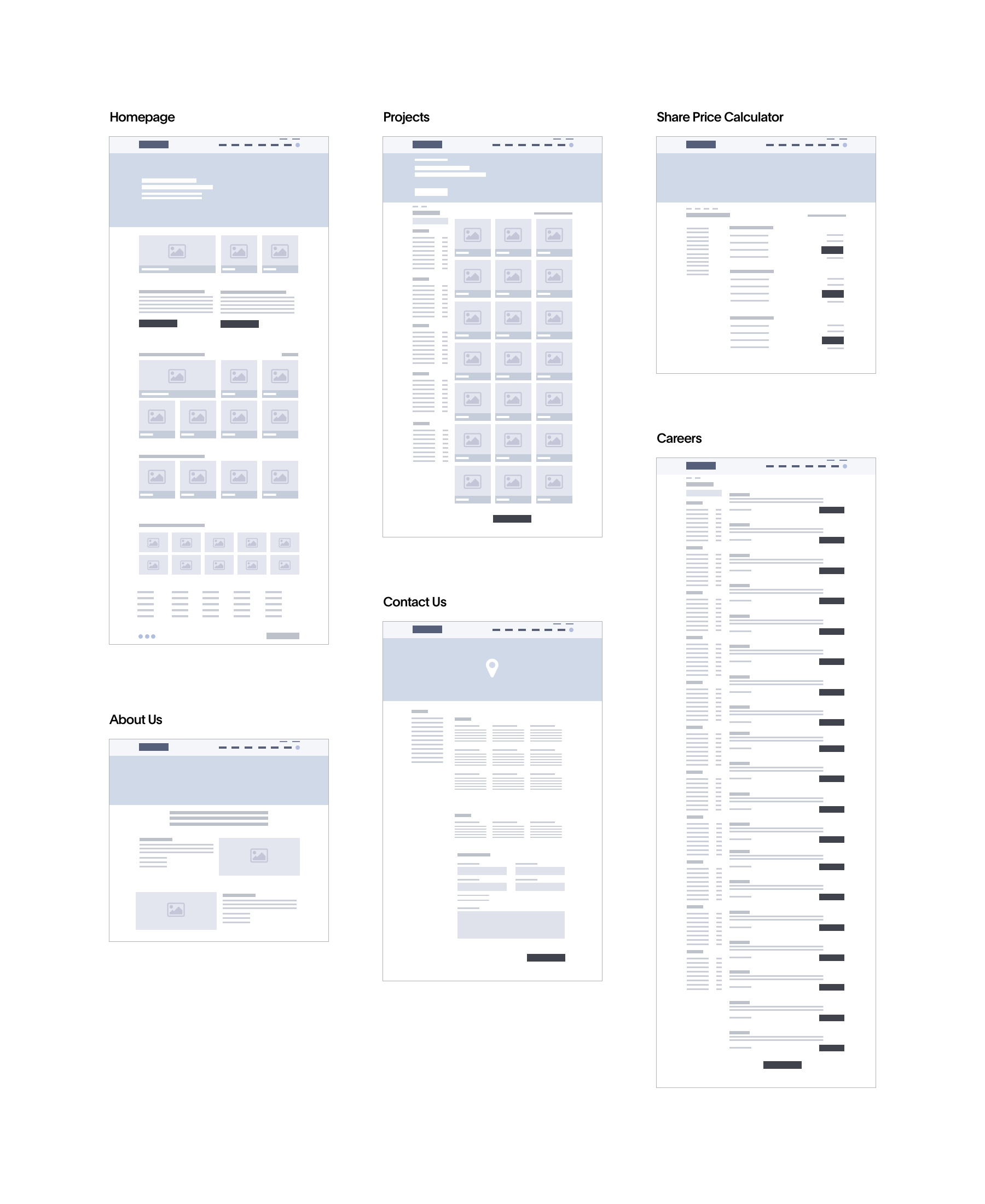
After validating my initial proposals for the visual aspect of the website, I created mid-fidelity Wireframes in Sketch, which helped me focus on the basic layout and visual hierarchy of the UI design before adding the styling. I was also able to present these wireframes and gain valuable feedback. During this process, I did my best to apply UX best practice for the pain points uncovered in the user research. My objective was to create an easy flow and a clearer way to navigate the platform.
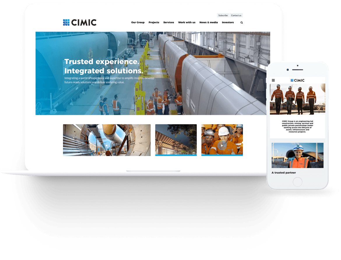
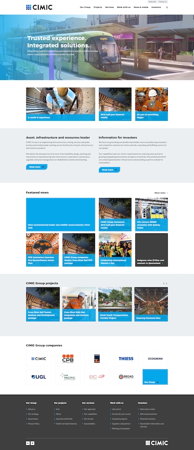
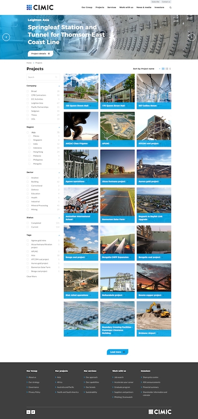
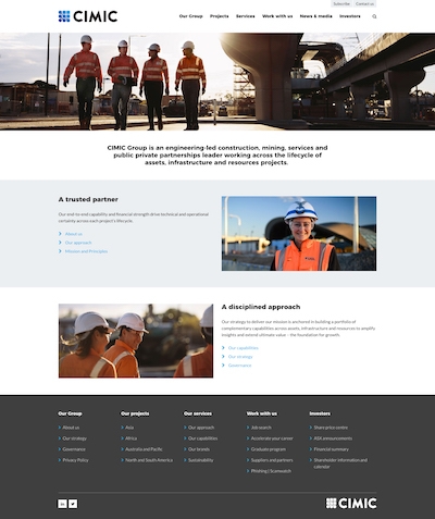
After producing the wireframes I created a clickable High-Fidelity Prototype using Figma for assessment. Stakeholders and Product Owner were able to review and feedback on the user flows. For this purpose, I produced 14 digital interfaces of all those pages required for users to complete the most critical tasks. I based my design decisions on the branding style that was handed to me by the client, in which I used light blue as the main color, mainly because it expressed ‘dependability’ which is one of the main values of the company. Since my research showed that users were more attracted by visual elements such as high-quality images and videos, I spent extra time selecting the right imagery (provided by client) that accompanied the content shown on each page. Once all interfaces were finished, I created the prototype for future testing.
For the next step, I conducted Usability Testing with 4 participants who had similar backgrounds to our personas. From Video Recordings and Heatmaps obtained with Hotjar, I was able to collect valuable usability feedback from target users. The main goal of this exercise was to determine if the proposed solution met the expectations of users who were familiar with the company. After collecting and analyzing the data, I was able to identify areas that cause confusion or hesitation to users. In general, the prototype fulfilled users’ expectations, although some minor tweaks were required, especially on those pages were the search functionality was a key component for finding the desired information.
As part of the built-out phase, migrating the original database to WordPress was the first step. I have previously migrated various proprietary and custom solutions to WordPress, including .NET and Python platforms, in addition to other custom PHP solutions. I used a spreadsheet for mapping the different fields from the old database to the new one. I run several tests with sample data and test snippets from the original database in order to find the right algorithm before doing the real migration. Once completed, I took care of building the Front-End (HTML, CSS, Javascript) and integrated it with the WordPress installation. Since the original site supported several different permalink types, I built a rewrite engine with over 30 different 301 rules, mapping the original links to the new system and extending the rewrite API that supports the following URL structure across the site for SEO improvement.
Users are now able to find information easily which lead them to quickly make a decision of filling out and submitting the contact form.
During the first three months after launching the website as a result of the redesign (No marketing campaigns involved).
For CIMIC, having a large corporate site meant it needed to ensure that any change made to the site would have a positive effect on company-level goals. With the new back-end system, the client was able to quickly see whether or not the changes they had made increased sales on mobile devices, but in order to get a deeper level of insight, I used Google Analytics for a period of 4 months. Most of the findings from data collected with this tool lead the team to make modifications on the content of specific pages throughout the website in order to make the User Experience more engaging. During this period, the number of leads increased considerably and the mailing list grew rapidly, which was a key component of the company’s future digital strategy.