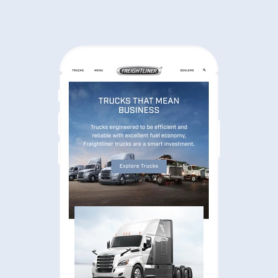
Toyota Forklift is the world’s leading brand of material handling equipment in the country. Proudly manufactured in the United States, Toyota Industrial Equipment offers a full line of material handling solutions including forklifts, automated guided vehicles, fleet management services and tow tractors.
As Lead UX Designer for 7strategy, my initial goal was to build a website that was more aligned with Toyota’s brand attributes and product quality. The project began with the discovery process, which helped me discover Toyota’s reasons and goals for the redesign project. After having an Interview with Toyota Forklift’s Executive in charge of the web project, I scheduled two Phone Interviews with the Director of Marketing in order to get a different perspective on the challenges and goals for the redesign. After collecting information and presenting the Business and Strategy Goals Document to the client, I was able to identify three key aspects of the redesign project:
After establishing the stakeholders goals for the redesign project, it was time to start digging into the main challenges the current website was having and why it was not producing the results executives were expecting.
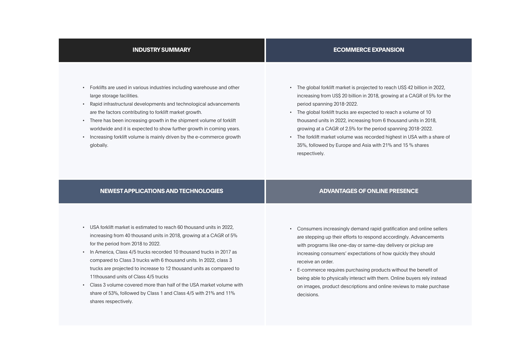
In order to do so, I run a Competitive Analysis, looking for information on what other similar companies were doing in what regards to their online strategy and comparing it with what Toyota Forklift was doing based on the goals previously defined by the stakeholders. This was done with the purpose of identifying the website’s weaknesses and challenges. The research showed that even though, Toyota Forklift was looking to do more businesses online, their website didn’t provide as many tools for this as their competitors, even though the Forklift market was shifting towards e-commerce.
To learn more about the user’s perception of the website, I asked the marketing director to recruit no less than 2 customers who were willing to tell us their experience with the current site. With his cooperation, I was able to conduct 5 Users Interviews. These consisted of 30 minutes Skype calls in which we discussed their motivations for visiting the website, along with their expectations and frustrations when interacting with it. From these interviews, I was able to identify 6 main tasks that users were looking to complete when visiting the site:
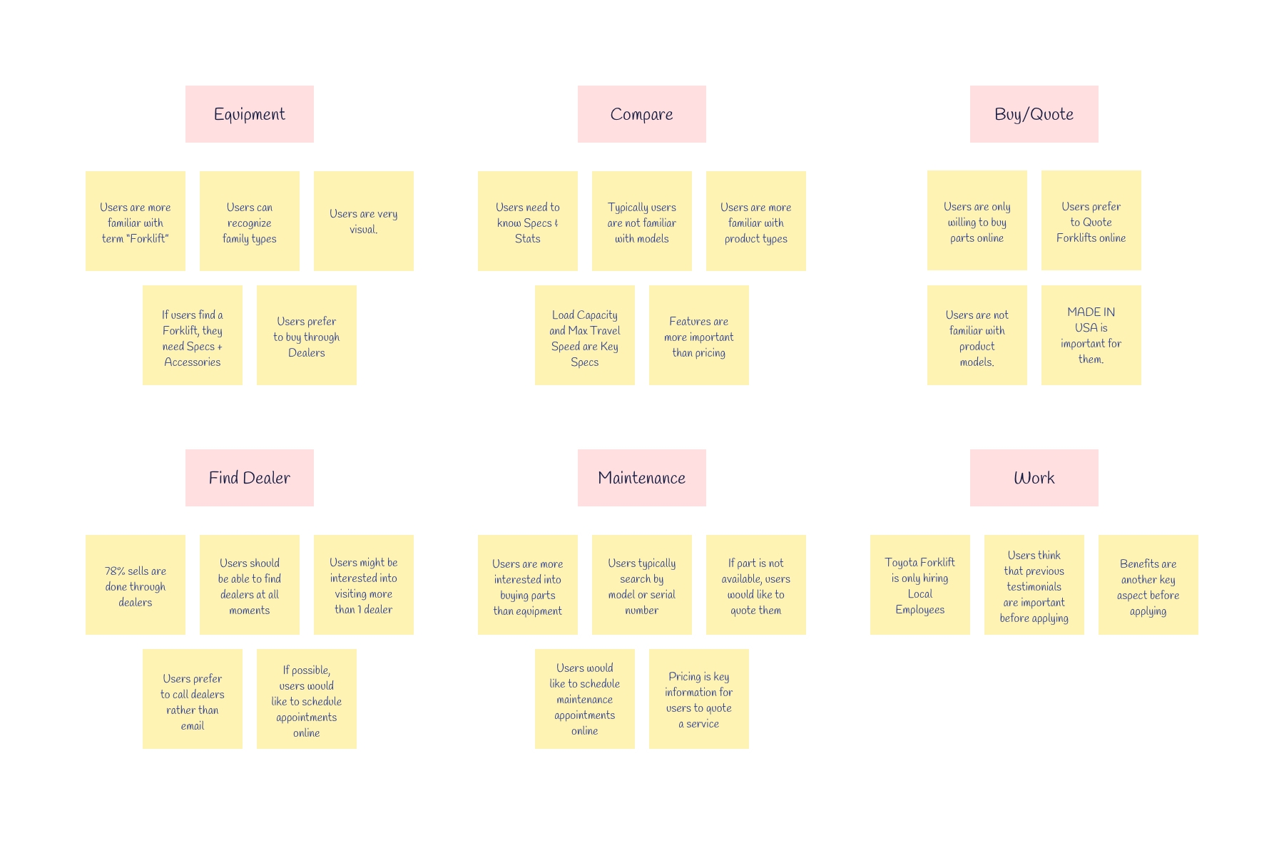
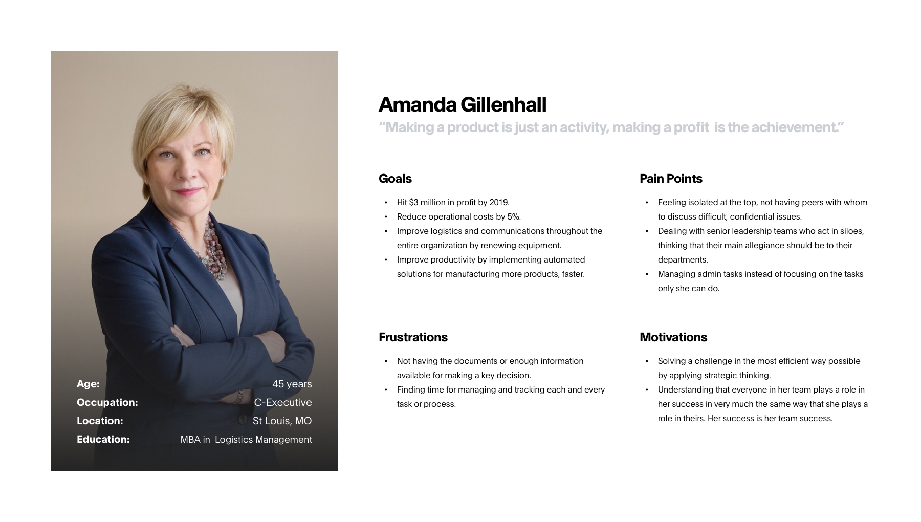
Based on the previous interviews, I was able to identify three different roles of potential users: Chief Executives, Process Engineers, and Technicians. Next, I created Personas for each one of them to represent the findings synthesized from the Affinity Maps. By giving context and personality to the research data, I was able to better empathize with the target user throughout the design process.
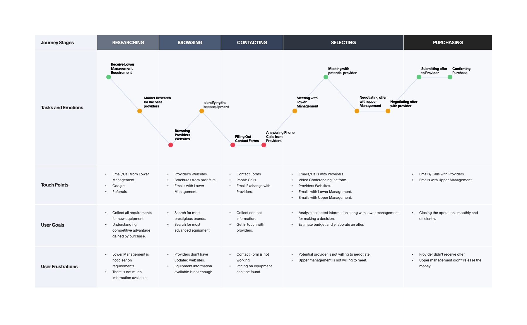
I then mapped out the User Journeys of these three personas, including their thoughts and feelings during their typical process of achieving their goals (i.e. acquiring new forklift equipment for their company). From this, I was able to temporally visualize their areas of frustrations and create a focal point on the problem space.
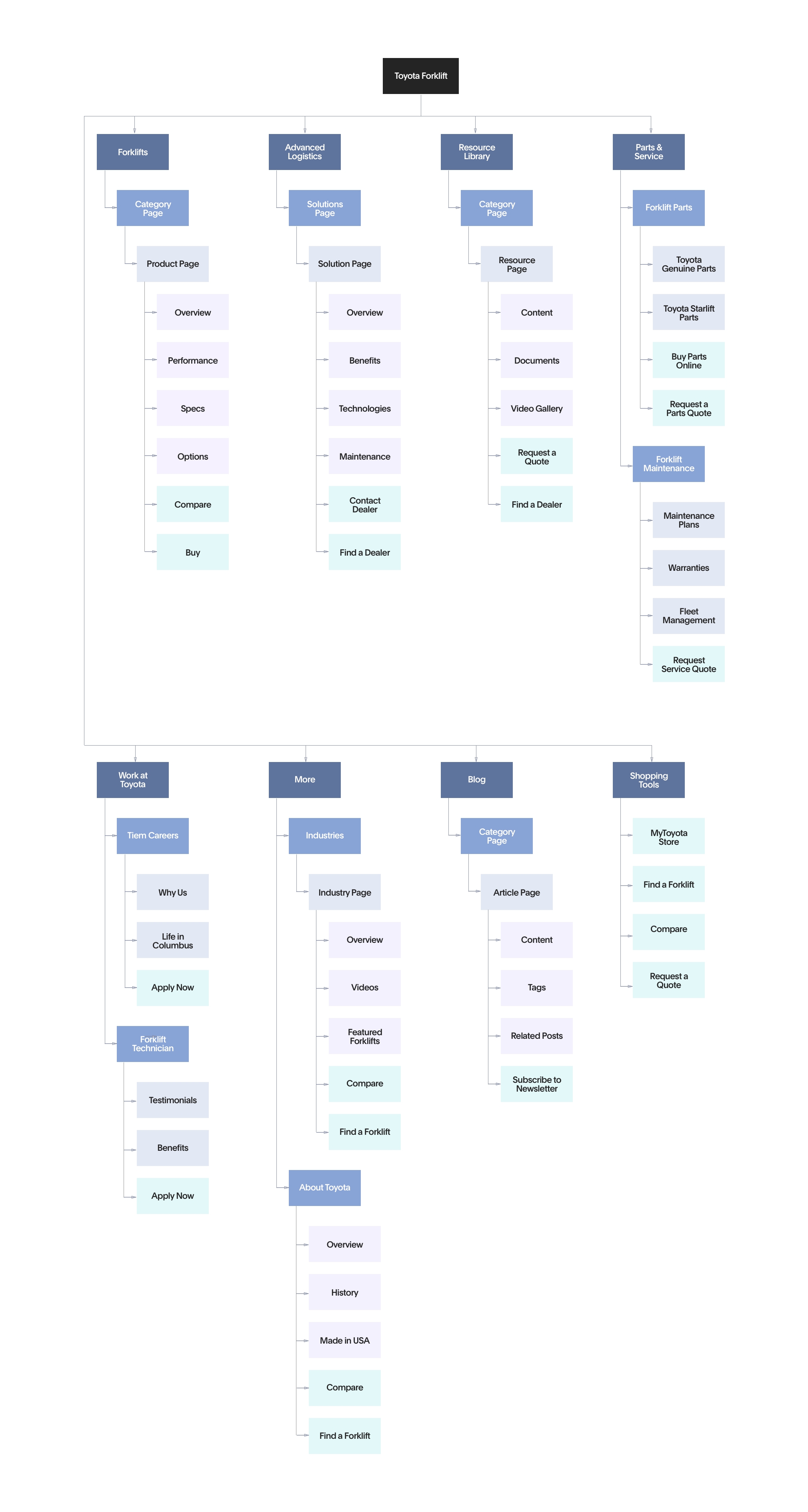
Due to the vast amount of information available on the current website, restructuring it in a way that fulfilled stakeholders and users goals was a bit of a challenge. In order to get the process started, I created an initial Information Architecture, which I presented to the people in charge of the project on Toyota Forklift’s side along with my findings from the interviews and user analysis. After three rounds of revisions, we were able to agree on a final Sitemap that fulfilled their expectations and in which letting users complete their tasks online was the main objective.
Once information on users and stakeholders goals for the website was collected and communicated in documents, I was able to start the process of brainstorming ideas for the visual appearance of the future website. I started out with rough sketches of the most critical pages, based on the tasks defined in previous phases of the process. With cleaner and annotated versions of the Sketches, I was able to present my ideas to 2 stakeholders (Marketing Director and Documentation Manager) and gain constructive feedback at an early stage of the design. During this process, I referred to examples of websites I collected during my competitive analysis and studied existing design patterns that make for more intuitive user experience.
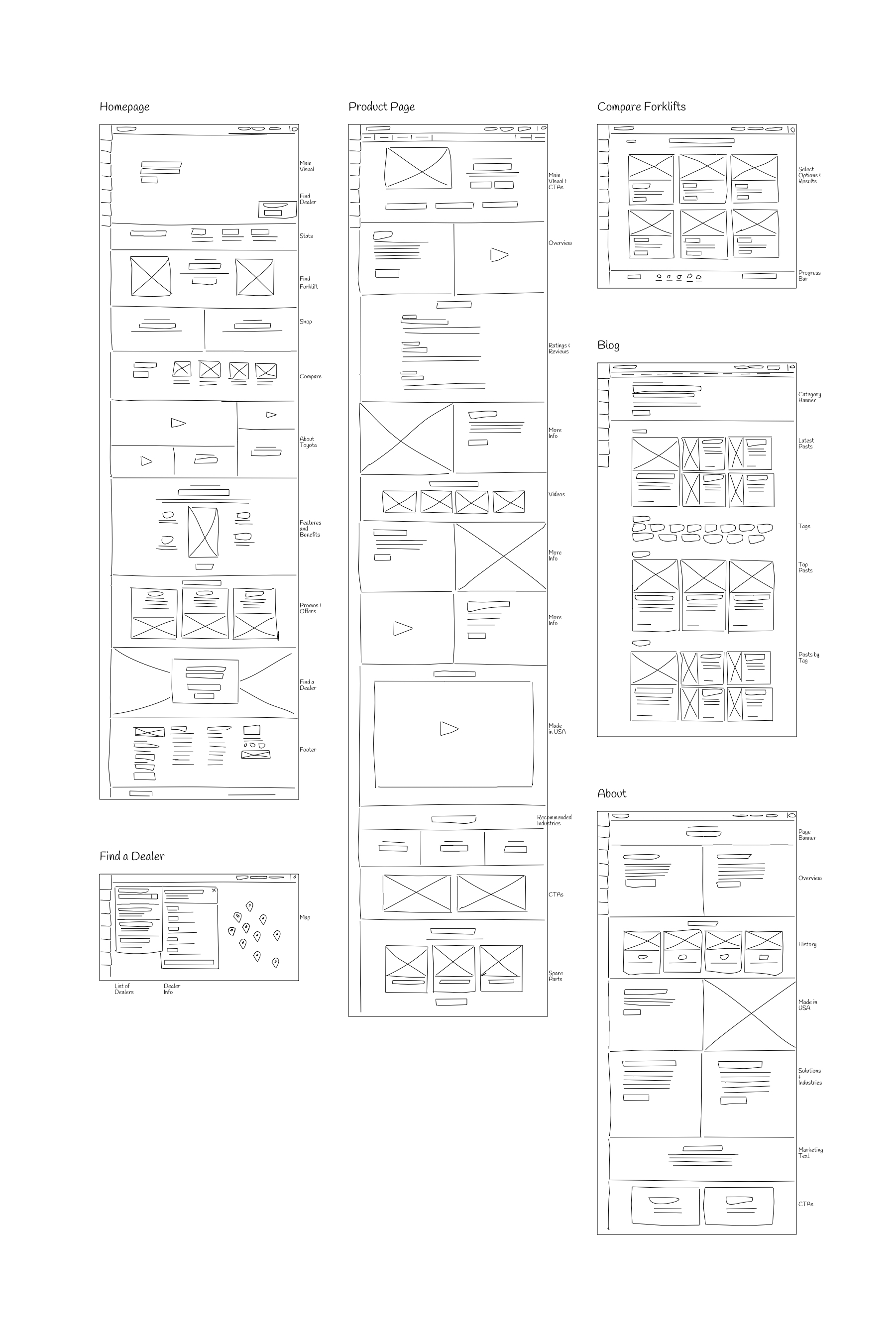
Before creating a high-fidelity prototype, I wanted to gain usability feedback about the current proposal without worrying about the visuals distracting participants or biasing their feedback. Therefore, I created a set of Wireframes using InVision of all those pages that were critical for users to complete the main tasks. I was able to do quick tests of the prototypes with 2 users who were participants during the research phase. For each testing, I provided the participants with links to the prototype and asked them to test it at their own convenience. I also asked them to fill out a Google Form in which they answered a Questionnaire of open and close-ended questions. Feedback provided was very valuable in order to refine the initial designs and identify problems, more specifically with the task of finding specific models and comparing forklifts.
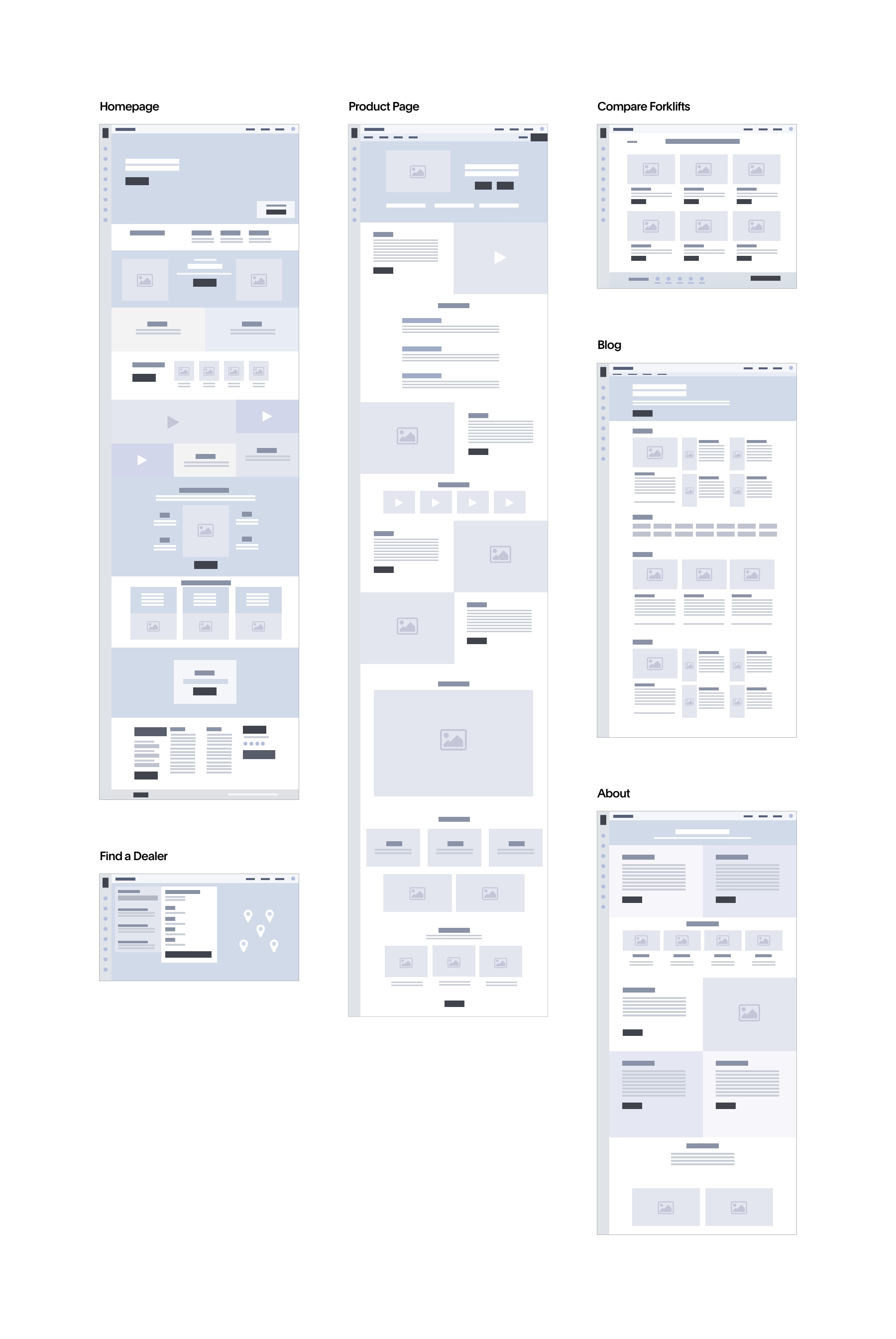
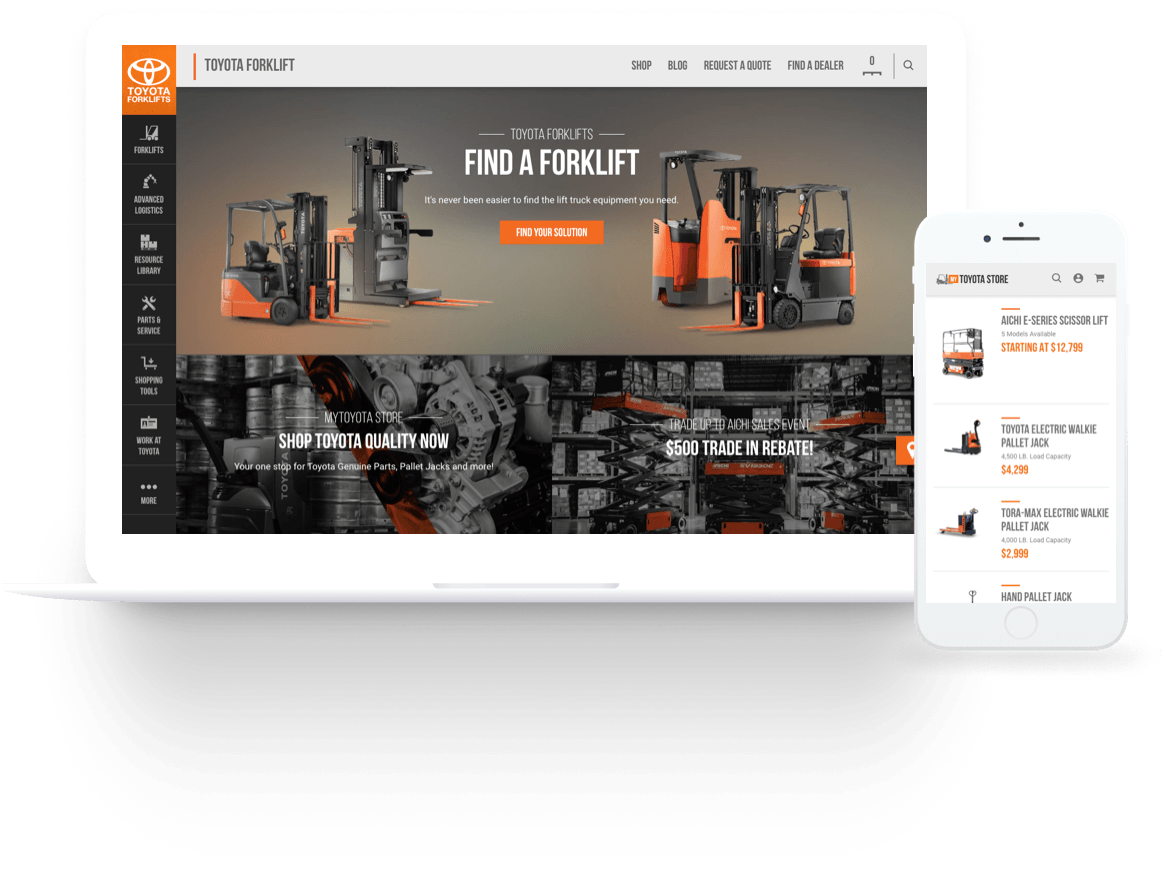
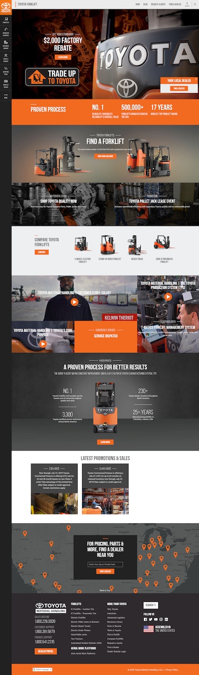
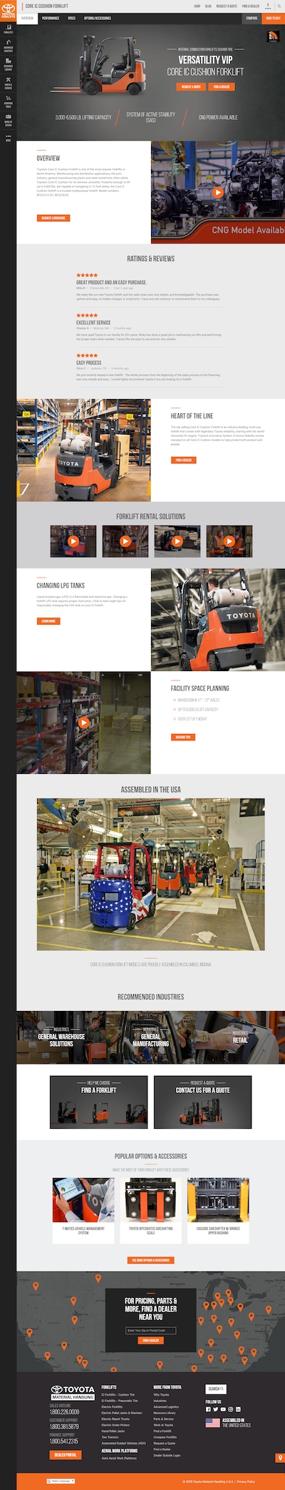
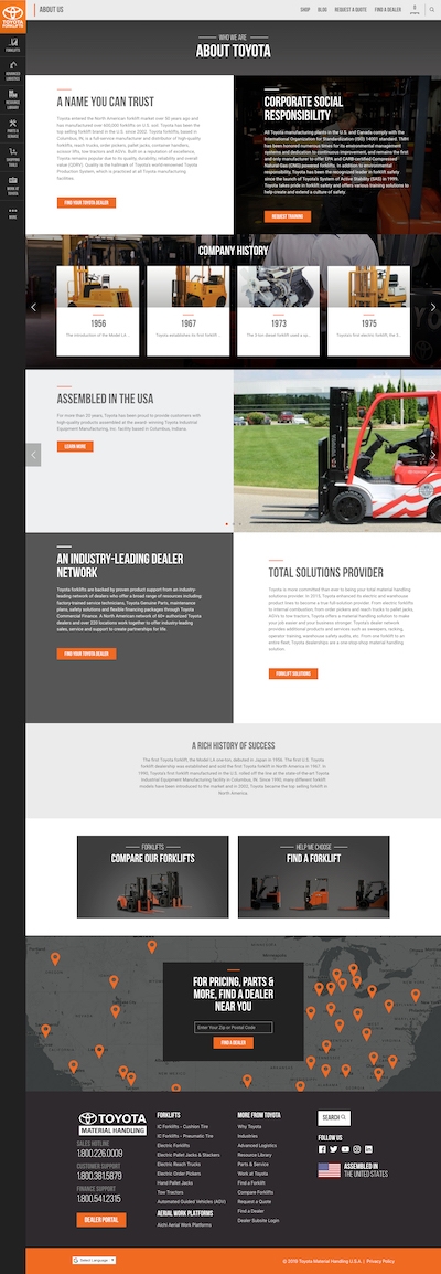
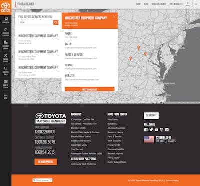
After two rounds of critique on the wireframes, I then moved on to creating High-Fidelity Designs for the new website. Since Toyota Forklift is a widely recognized brand, with an identity already established, I was able to directly move into designing without having to create an identity package. The brand guideline was provided by the client and I used Sketch for producing 24 interfaces of all the main sections of the website. The motivation of the visual design was to create a bold fresh look that motivates the user to take action by expressing the desired message mostly through the imagery of the actual equipment or people operating it. Orange and black where the two main colors since those are the ones present in all their equipment, and which can be easily recognized by potential customers who were already familiar with the brand.
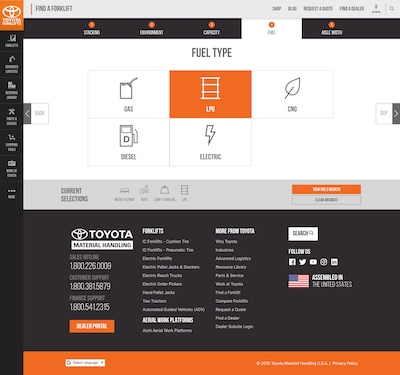
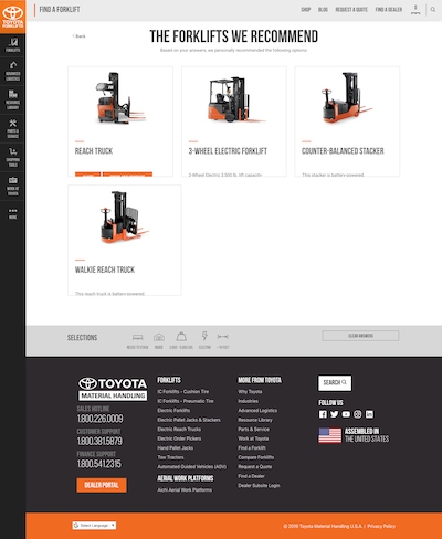
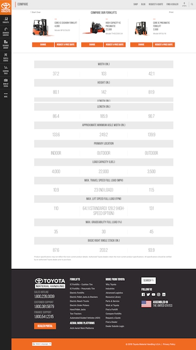
The next step consisted in putting together all the mockups produced into a Prototype for doing Usability Evaluation. For this purpose, I used Marvel App and uploaded all the interfaces as a project. After adding the different interactions and linking all interfaces, I shared the project with two participants who were Toyota Forklift’s employees and asked them to do the evaluation. These consisted of 45 minutes Skype Calls in which I asked them to complete specific tasks in the website while Thinking Aloud, providing me with feedback on what they were seeing. Main challenges for both participants were related with the “Request a Quote” form and “Find a Forklift” functionality, which is why I decided to simplify it before presenting the final results to the project sponsors.
After doing the corresponding modifications and improvements on the high-fidelity prototype, and receiving approval on it from Toyota Forklift’s management, it was time to start with the built-out of the new solution. I started with a fresh installation of WordPress latest version and developed a custom theme from scratch. Programming was modular, coding HTML, CSS, and Javascript for the main screen first, and doing progressive deliveries of the front-end to the client for receiving approval before moving on into the Back-End Development. After receiving approval on the demo, I gave access to the back-end to copywriters for start working on the population of the site.
After launching the new website, the amount of "Request a quote" submissions increased from 16 to 35 per day.
With the website redesign, user engagement increased from an average of 28 seconds to 1:07 minutes.
Right after launching the new solution, I did the integration of the website with Google Analytics for measuring its performance by defining conversion goals and assigning them to specific pages and buttons. After monitoring the site for a two months period, I was able to identify changes in the behavior patterns. Bounce rate was considerably reduced and people started spending more time in the website (which was essential for stakeholders, since they recognized that gathering information on Forklifts was essential for users to make a decision on whether to not purchase equipment from them). This was confirmed by the Marketing Tools used by the client for measuring the number of submissions received through the different forms.